

Creating Accessible Content
Websites today have to meet numerous requirements. Everyone wants to be able to access information on any device, anywhere, without restrictions or barriers. The use of mobile devices with smaller screens and sometimes slow internet connections is now commonplace. However, usability with alternative technologies, such as screen readers that work with voice output and keyboard operation, must also be ensured.
To meet all these requirements and make information accessible to everyone, there are a number of things to consider. The basic guidelines on usability and accessibility provide important orientation.
In OPAL and ONYX, authors can create and design various types of content. Among other things, you can use the text editor to provide descriptions and page content in the course. We have prepared some tips and further content for you.
How do I structure content?
When structuring texts on websites or in documents, it makes sense to use books or articles as a guideline. The headlines, bulleted lists, table of contents and visual highlighting used there help to improve readability, skimming or scanning with the eyes, and, therefore, make it easier to find relevant information quickly. These elements also help users to find their way around the site. In addition to visual structuring through design, technically correct structuring by means of suitable HTML elements is also necessary. This is particularly relevant for accessibility, as screen readers and other assistive technologies transmit information based on HTML code and provide various functions.
Headings
Headings should not be created by changing the font size or using formatting such as bold, but rather using the HTML elements <h1>, <h2>, <h3> to <h6>. The element hierarchy (e.g. <h2> follows <h1>) must be maintained.
Formats in the Tiny MCE text editor

HTML code for headings
<h2>Überschrift 2. Ordnung</h2>
<h3>Überschrift 3. Ordnung</h3>
<h4>Überschrift 4. Ordnung</h4>
<h5>Überschrift 5. Ordnung</h5>
<h6>Überschrift 6. Ordnung</h6>
Paragraphs and highlighting
Paragraphs, quotations or highlighted text in boxes help to break up a text and allow readers to jump to the relevant information if necessary.
Formats in the Tiny MCE text editor

HTML code for paragraphs
<blockquote>Zitat</blockquote>
Lists
Lists can be used to present information clearly, briefly and concisely. Choose between unorganized and organized or numbered lists.
Lists in the Tiny MCE text editor

HTML code for lists
<li>list entry</li>
<li>list entry</li>
<li>list entry</li>
</ul>
<li>list entry</li>
<li>list entry</li>
<li>list entry</li>
</ol>
Tables
Using tables
Please use tables only to present data in tabular form. Tables should not be used to display text or other content side by side or in “columns” for visual reasons (layout tables).
It is worth considering whether a table is necessary or whether the content could be presented more simply, e.g. by means of a list.
Table headings (Caption)
Each table should have a heading that provides a brief summary of its content. You can use the HTML element <caption> for this purpose.
In the Tiny MCE text editor, you can activate the table caption in the table properties. When you do this, some text will appear above the table, which you can change to match your content.
How to activate table captions in the Tiny MCE text editor

HTML code for captions
2
3
4
<caption>Vorträge zu den Gruppenarbeiten</caption>
...
</table>
Column and row headings
Cells for headings (header cells) should be distinguished from data cells not only by design, but also by HTML. Header cells in tables are therefore marked with the HTML tag <th>, data cells with <td>.
You can additionally link the header cells to the data cells via the ‘scope’ attribute. This ensures that your headings are assigned to the rows or columns and that the output via screen readers is correct.
In the Tiny MCE text editor, you can use the cell properties to define your selected cells as headings and assign them to columns or rows.
- To do this, select your preferred cells and open the cell properties via the menu (Table > Cell > Cell Properties).
- Now select ‘Header cell’ in the dialogue box under ‘Cell type’.
- Select ‘Column’ from the ‘Scope’ option.
- Repeat this action if you use row headings in addition to column headings. In this case, select ‘Line’ under the ‘Scope’ option.
How to define header cells in the Tiny MCE text editor


How to mark header cells in HTML
2
3
4
5
6
7
8
9
10
11
12
13
14
15
16
17
18
19
20
21
22
<caption>presentations on group work</caption>
<thead>
<tr>
<th scope="col">date</th>
<th scope="col">time</th>
<th scope="col">topic</th>
<th scope="col">place</th>
</tr>
</thead>
<tbody>
<tr>
<td>04.03.</td>
<td>10 - 11 a.m.</td>
<td>sustainability<td>
<td>room3b</td>
</tr>
...
</tbody>
</table>
Further information
How can texts be made easy to read?
Font, font size, character and word spacing, line length and many other factors influence the readability of texts.
- Make sure to use common fonts (like Arial) and avoid fancy or hard-to-read ones.
- The font size for large screens should be between 18px and 26px. For small devices, such as smartphones, you should use smaller font sizes because the device is usually closer to the eye.
- The line spacing should be at least 120% of the font size, preferably 150%.
- The line length should be between 45 and 80 characters per line, including punctuation and spaces.
Please keep in mind that font size, line spacing, and line length depend on both the font and the device you're using.
Further information
How should links be set?
Links need meaningful titles and should describe the purpose or destination of the link. Ambiguous link texts such as ‘more’, “here” or ‘read more’ should be avoided. Relevant information about the format or size of a file (e.g. for a download link) should also be included in the linked text.
What should be considered when using media?
When using media, consider not only storage consumption and loading times, but also its accessibility on the go, e.g. on a smartphone with a poor internet connection. Ensure that information is always available via a second channel, such as text.
Here are some tips you might find useful regarding accessibility and mobile compatibility.
File size:
- For photos, JPEG format should be preferred and medium to high quality should be selected depending on the image content.
- Images should not exceed a file size of 100-200kB.
- Save the images directly in the required image size (width x height) with a resolution of 72 dpi.
- For very large files, such as videos, we recommend embedding them via an external tool (e.g. Videocampus Sachsen, YouTube, Vimeo, etc.).
Bildunterschrift
Die Bildunterschrift bzw. der Bildtitel stellt eine zusätzliche Beschreibung zum Bild dar. Ein Bildtitel ist notwendig, wenn wichtige Informationen zum Bild vermittelt werden sollen. Im Gegensatz zur Bildbeschreibung (Alternativtext) ist der Bildtitel auch für Sehende zugänglich.
Verwenden Sie folgenden HTML-Code um das Bild und den Bildtitel barrierefrei zu gestalten:
Bildunterschrift mit den HTML-Elementen figure und figcaption
2
3
4
<img src="..." alt="Alternativtext">
<figcaption>Bildtitel / Bildunterschrift</figcaption>
</figure>
Alternativtext
Für Bilder, die relevant für den Inhalt einer Seite sind, sollte ein Alternativtext hinterlegt werden. Dieser wird u.a. von einem Screenreader ausgegeben und ist somit für blinde Menschen zugänglich. Aber auch wenn die Bilder auf der Seite deaktiviert sind oder aufgrund einer langsamen Internetverbindung nicht geladen werden, kann die Information trotz fehlendem Bild übermittelt werden.
Folgendes ist bei Alternativtexten für Bilder zu beachten:
- Kurz halten: Der Alternativtext sollte nur die wichtigsten Informationen enthalten. Grobe Richtlinie: 125 Zeichen.
- Informationen beschreiben: Nur die für den Kontext (z.B. den Text) relevanten Informationen, die das Bild übermitteln soll, beschreiben.
- Bilder, die nur der Gestaltung dienen, sollten keinen Alternativtext (leeres alt-Attribut) erhalten. Im Texteditor können Sie diese Bilder als dekorativ markieren.
Alternativtext im Texteditor Tiny MCE hinterlegen
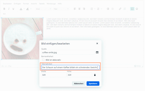
Alternativtext im HTML hinterlegen
Bild als dekorativ markieren

Im HTML: Leeres alt-Attribut für Bilder ohne relevante Informationen
Weiterführende Informationen
- Empfehlungen, wie gute Alternativtexte und Bildbeschreibungen verfasst werden in der Broschüre "Gut Fürs Image" (PDF)
- How to write better alt-text descriptions for accessibility
- Five golden rules for compliant alt text
Bilder für Smartphones und Tablets optimieren
Damit Bilder auf Geräten mit kleineren Bildschirmen vollständig dargestellt werden, ohne das Nutzenden horizontal scrollen müssen, sollte die maximale Breite im HTML auf 100% begrenzt werden. Dadurch wird das Bild nur so lange in der gewählten Größe dargestellt, bis es breiter ist, als der verfügbare Platz auf dem Bildschirm. Danach wird es dynamisch an die verfügbare Breite angepasst.
Mit max-width eine maximale Breite für Bilder setzen
Alternativen für Videos und Audio-Dateien bereitstellen
Beim Einsatz von Medien sollten die Informationen stets auch in einer alternativen Form angeboten werden. Neben der Bildbeschreibung (Alternativtext) für Bilder sollte an reine Audio-Inhalte (z.B. Podcasts) und Video-Inhalte mit Bild und Ton gedacht werden.
- Bieten Sie alternativen Inhalt oder ein Transkript an, wenn Sie Audio-Dateien wie z.B. einen Podcast verwenden.
- Stellen Sie Untertitel und eine Übersetzung in Gebärdensprache für Video-Inhalte bereit.
- Binden Sie Medien von externen Plattformen, wie z.B. YouTube oder Videocampus Sachsen ein.
Weiterführende Informationen
Farben & Kontraste
Achten sie bei der Auswahl von Farben auf ausreichend Kontrast zwischen Hintergrund- und Textfarbe. Grundsätzlich hat Schwarz auf Weiß das beste Kontrastverhältnis, generell sollte das Verhältnis mindestens 4,5:1 betragen (WCAG 2.1 - Contrast).
Farbe sollte weiterhin nie als einzige Hervorhebung einer Information genutzt werden. Ergänzen Sie z.B. bei Hinweis- oder Fehlermeldungen ein gut erkennbares Icon sowie einen zusätzlichen Texthinweis. Verzichten Sie auf Anleitungen oder Beschreibungen, die sich nur auf eine Farbe oder andere visuelle Eindrücke beziehen, z.B. "Klicken Sie auf den grünen Button".
Weiterführende Informationen
Nützliche Werkzeuge
- Webseiten prüfen mit der WAVE Toolbar.
- WAVE für Google Chrome (Browser-Erweiterung)
- WAVE für Firefox (Browser-Erweiterung)
- Kostenfreier OpenSource Screenreader für Windows: NVDA herunterladen
- Checkliste: barrierefreie PDF-Dokumente von Einfach für alle